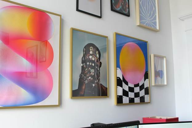
Artwork rarely fails on the wall due to any flaw in the art itself. The trouble often comes from the edge around it. A practical border, paired with the right frame, gives the piece a clear boundary and a calmer presence.
What a border does for the eye
A border acts like a pause between the artwork and the room. It separates color, texture, and detail from paint, wallpaper, shelves, and sunlight nearby. That small gap helps the viewer read the work as one complete object.
Borders can shift mood without changing the art. A narrow, crisp edge can feel tidy and modern. A wider border can feel slower and more reflective, giving the image space to land. It can produce quite loud wall patterns.
Sizing rules that keep edges looking clean
Custom borders start with a simple question: how should the piece sit in its own space? Odd sizes, rough deckled edges, and handmade paper all behave differently once they reach the wall. A border plan keeps those quirks from turning into distractions.
Standard sizes can leave one side looking tight and the other side looking loose. A workshop approach, using made to measure picture frames, keeps every side consistent and avoids a squeezed look. Consistent spacing matters most when several pieces hang together in a row. That balance keeps corners from feeling off.
A clean edge can come from a mat, a spacer, or a visible frame lip. The best choice depends on the surface and the level of depth. Flat prints often look like a crisp window, and thick canvas often looks better when the edge stays visible.
Shadow gaps for canvas and textured work
Some pieces need a border that does not touch the surface at all. Thick canvas, panels, and textured mixed media can rub against a tight frame and pick up scuffs. A small air gap solves that without adding a wide mat.
A DIY framing guide from Metallbude describes a shadow gap frame as a way to create a floating effect that reads as more polished on the wall. The gap casts a soft inner shadow that outlines the piece. The result feels deliberate, even when the artwork itself is bold or rough.
Shadow gaps work well with modern photos on panel, acrylic pours, and stretched canvas. They can keep the edge visible, which matters when the artist painted around the sides. The border becomes part of the work, not a cover for it. Edges stay safer during handling.
Mat widths that give prints room to breathe
Matting does more than add a white border. It creates distance between the art and the glazing, and it can keep the image from feeling crowded. The mat width sets the rhythm of the whole presentation.
A guide from C.Y. Painting suggests a pleasing look when the mat is about 1.5 times the width of the frame. That ratio can stop the frame from overpowering a small print. It can keep a wide frame from making the center image feel lost.
When planning mat width, a few practical checks help:
- Match the border weight to the detail level in the art.
- Give darker pieces a little more breathing room at the edge.
- Keep the bottom margin slightly larger if the piece will hang high.
A consistent mat color supports the art. Clean bevel cuts keep the window edge sharp.
Glazing choices for light, glare, and safety
Glazing changes how people experience a piece across the day. Bright windows can wash out fine detail, and ceiling lights can throw harsh reflections. The right glazing can reduce that visual noise. Light direction changes from morning to night.
American Frame notes that many acrylic options are made to cut glare and block UV light. That can matter for prints and photos that fade as the years pass. Acrylic can be lighter than glass, which can reduce the risk of large frames or in high-traffic spots.
Glass still has a place when weight is not a concern and a hard surface feels right. Acrylic can scratch if handled carelessly, so clean tools and soft cloths matter. Either way, a border that holds the glazing off the art helps prevent sticking.
Small details that keep a display looking fresh
Borders and frames deal with daily life, not just gallery lighting. Dust settles, humidity shifts, and walls get bumped during cleaning. A practical plan builds for those realities.
Tight corners and square cuts keep lines straight at a distance. A backing that stays flat helps stop ripples in paper. Hanging hardware should match the frame weight. Simple habits like leaving space from a radiator can cut down on warping and discoloration.

A good border is not only about style. It guides the eye, protects the surface, and supports the way the work lives in a real room. When the edge is planned with care, the art can speak without competing with its surroundings.
Buy Me A Coffee
The Havok Journal seeks to serve as a voice of the Veteran and First Responder communities through a focus on current affairs and articles of interest to the public in general, and the veteran community in particular. We strive to offer timely, current, and informative content, with the occasional piece focused on entertainment. We are continually expanding and striving to improve the readers’ experience.
© 2026 The Havok Journal
The Havok Journal welcomes re-posting of our original content as long as it is done in compliance with our Terms of Use.


